


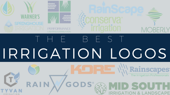
After looking at over 300 irrigation logos (a conservative estimate) we selected the 16 logos we thought were the best. And “best” when it come to a business’s logo can mean many things. It’s kind of like art, everyone has the right to their own interpretations, opinions, and taste. But with that said, there is really bad art. So, we based our “best” off of the logo best practices we cover last week: How to Create an Irrigation Logo
[READ: Irrigation Business Essentials]
Aquatech
Ontario
![]()
Why:
Lowercase font has become a go-to feature since the beginning of the digital age. Add that to the the font type that oozes technology you have a timely logo for the modern age.
Rain Gods
Ontario

Why:
Simple, unique, versatile, memorable, Rain Gods doesn’t just have a bad-ass name, they also have my personal favorite logo. On top of that, if you’re looking for an example of a great website check out their website.
RainScape
Florida

Why:
The first of two RainScape logos on this list is clean, simple and smooth with a great color palette. The rain drop over the ‘i’ is the cherry on top.
Conserva
Multiple States

Why:
The combination of colors is why I’m a huge fan of this logo. It’s almost like their name in fresh green is being kept alive by the life of those spraying blue dots to its left.
Tyvan Irrigation
Alberta
Why:
It looks like this logo should almost be for some type of scientific research company. The way the top and bottom is structured make it fully versatile to be put on anything they’d want for branding.
Rainscapes
Tennessee

Why:
This type of logo isn’t usually one I’d find interesting but it’s executed very well and is as professional-looking a logo can be.
Kore
British Columbia

Why:
If you have the guts to have make an orange logo you deserve to be put on this list. Kore zigged whenever zagged and that makes their logo stand out. Plus the font type they chose is wicked cool.
Advanced Irrigation Systems
New Zealand
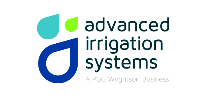
Why:
Check out the Kiwi’s putting together just an excellent logo. This three color palette with lowercase font is easy on the eyes.
Honorable Mention
Moberly Irrigation
California
Springhouse Irrigation
New Jersey

Mid South Irrigation
Tennessee

Advanced Landscape Irrigation
North Carolina

Desert Gardens
New Mexico

Evergreen Outdoor
Michigan

Performance Lighting & Irrigation
Tennessee
Warner’s Outdoor Solutions
Minnesota