Some very successful businesses have very outdated websites that could be doing them more harm than good. Security and search engine rankings can be hindered by an outdated, poorly designed site. But your website might also suffer from a user experience issue, which harms your overall website performance.
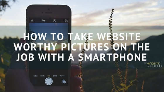
Quality pictures is an area where (generally speaking, because a few businesses do this VERY well) most green industry websites suffer. It was understandable and even excusable in the past since hiring a professional photographer can cost thousands of dollars. Justifying spending that money just wasn’t possible for most businesses. But things have changed, you no longer have an excuse for not having killer pictures on your green industry website. And the reason for that is because of a piece of technology that over 68% of adult americans own. If you’re like half of our blog readers, you’re probably using it to read this and if not, it is still most likely within arms reach. Here is how you can take website worthy pictures for your green industry business website using an iPhone or any other smartphone.
Setting the scene
Natural light is your friend
If you want to take website worthy photos using your smartphone, use natural light. Keep the sun to your back when you’re taking the shot. The great news for green industry professionals is that they typically are only able to be out in the field if the weather is decent, so you already have the weather advantage on your side! Find a location that you can shoot with the sun behind you.
Include people
For some of your shots, you might not want to include people. Before and after shots for a lawn maintenance company website might be better suited without any humans in the picture, people might get the impression the before and after shots are for weight loss….and if that human subject in your picture is a customer, that might be a good way to lose them!
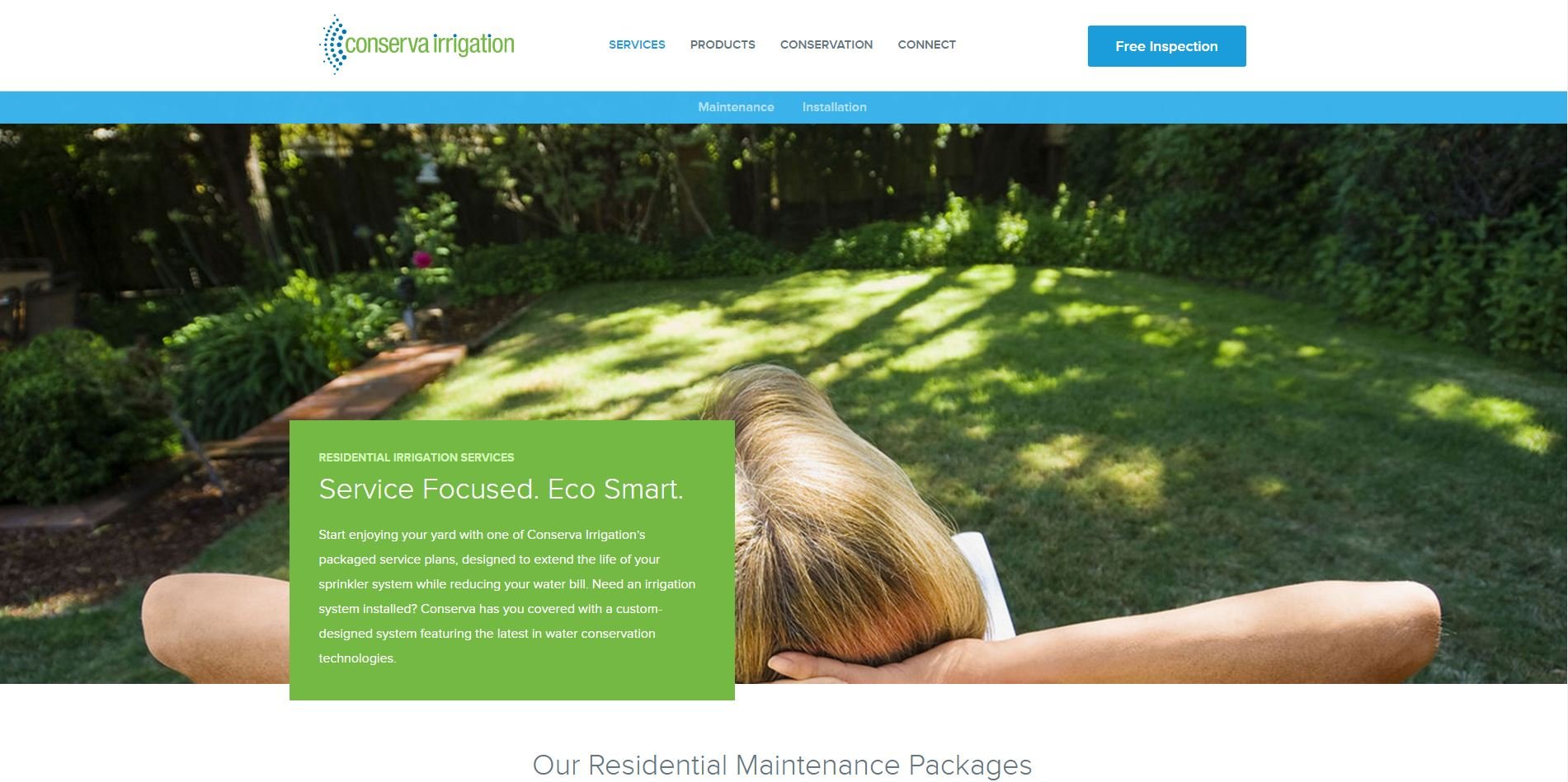
Having people in your pictures adds a human element that people want to see on your website. If you’re able to ask a customer to stand in for a few pictures or show your field techs working hard, it is a nice touch for your website.

Simple beats complex
Don’t take pictures with a lot going on. A simple shot works best for a website. It might look great at the time, but any distraction on your website might pull the user away from the actions that you want them to take. A busy picture can be the reason that a user doesn't click on a Call Us Now button or an email form.
Taking the shot
Use your grid lines
Turning your grid lines on helps you line up a shot. It makes it simple for you to use the natural lines of the landscape. It also gives you a good idea of what your shot will look like on a website. You might be able to tell if something is too far away, too far to one side or it just looks odd. Which brings me to my next point!
Use the rule of thirds
This is a concept that is used by professional photographers to frame their shots. It is really quite simple, but it can make your photos look amazing! Amatuer photographers often will take a picture with the main focal point directly in the center of the picture.
The idea of the rule of thirds is that you break up your shot into three equal parts, both horizontally and vertically. Most smartphones’ grid lines will be broken up in this manner. Where those lines meet, you should set your focal point of the image on that. So if you were taking a picture of a sprinkler head, place the actual sprinkler head off center to the bottom of your screen and either to the right or the left.
NEVER zoom
Just don’t do it. The cameras on smartphones are pretty dang powerful, but they don’t zoom particularly well. They don’t have a telephoto lense that is able to zoom without distorting the image.
Instead, simply use your feet and get closer. It will give you a much clearer image. And if you still find you are too far away, it is better to crop an image after the fact than to zoom. If you’re taking a picture of a freshly cut lawn, you should be able to capture the whole scene in high enough resolution without having to zoom in.
Stabilize your phone
At best, use a tripod, you can find an inexpensive one online that should do the trick. If not a tripod, try and lean your elbows against something solid to steady your hands. And if neither of those things are a possibility, at the very least, use two hands to take the shot!
Editing
There’s an app for that
There are plenty of editing apps out there that can make your photos look website worthy after you already have them. One app is Snapseed, which allows you to edit the brightness, sharpen pictures, crop and much more! It is a pretty powerful tool to use and you don’t need to be an expert photographer to figure it out!
Different types of photos you should have on your website
Before and after - Since much of what green industry businesses do is based on how a lawn looks or how a landscape looks, you should show how you improved a property or location
Landscape- Snap a few simple pictures of some of your work. I you've installed an irrigation system that has worked exceptionally for a customer, see if they would allow you to take a few pictures.
“Action”- People want to see your squad in action! Take a few shots of your employees working hard.
Customers- Get a few pictures of happy customers enjoying their lawn or landscape. It humanizes your services and people checking out your website can relate to other customers.


