A few years back we put together a list of the best green industry websites. Since then, a bunch of businesses have revamped their websites or created entirely new ones so we thought it'd be a good idea freshen up our list.
Whether you own a lawn maintenance, irrigation or landscape business you have the opportunity to have a website that not only converts visitors but is also easy on the eyes. The fact that the work you do aesthetically impacts a property means you should - in some way - show this transformation. And this visually-forward approach should also seep into the design of your website from the initial homepage to the specific landing pages. As you'll see the following websites do just that in their own unique ways.
The Best Lawn, Landscape & Irrigation Business Websites
[2019 Update]
Rain Gods
Toronto, Canada
Simplistic beauty: Rain Gods is arguably the best name in the green industry. They also have one of the coolest logos. And their website perpetuates the brand with a clean, simple website with beautiful imagery.
The Goods:
• Easy Navigation • High-Quality Images
• Scroll-Responsive CTA • Smooth Layout
• Expansive Yet Simple Design
Andre Landscape
Azusa, California
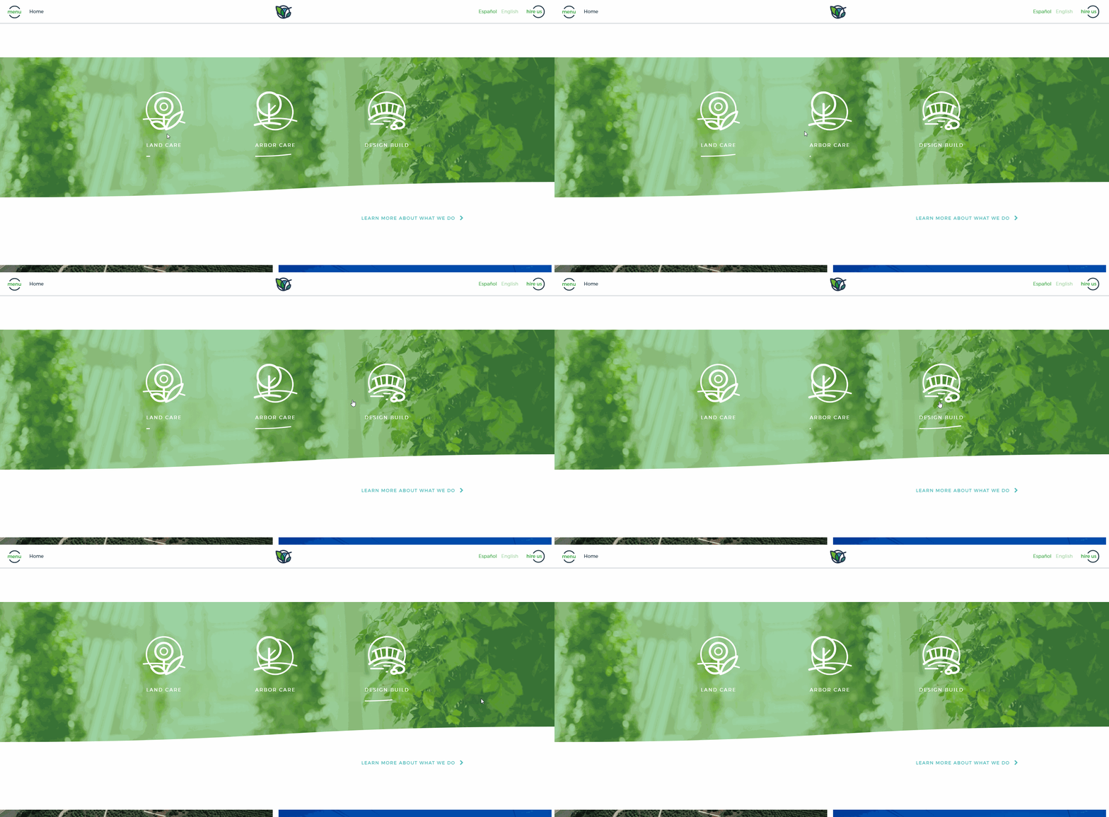
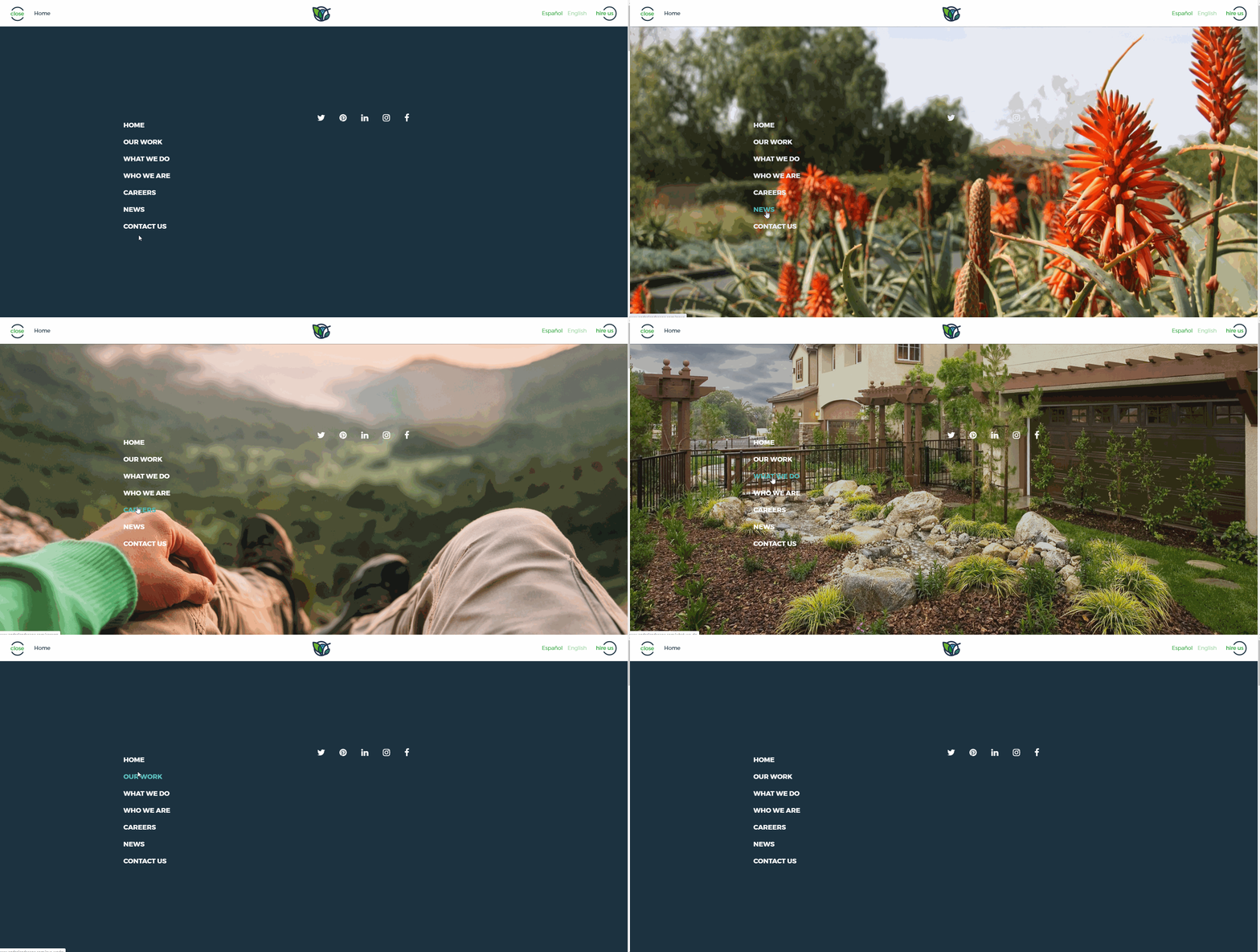
Slow is smooth, smooth is fast: As a marketer, I’m a bit obsessed with Andre Landscape’s branding. Like Rain Gods, their logo is really well done and probably the best in the industry. Their website with its scroll navigation is really smooth and responsive. The section button animation (in the middle of the homepage) is one of those little things that make a website look professional. And usually I’m not a fan of cheesy quotes but Thoreau’s “We can never have enough nature” is a pretty cool nugget from a pretty cool dude.
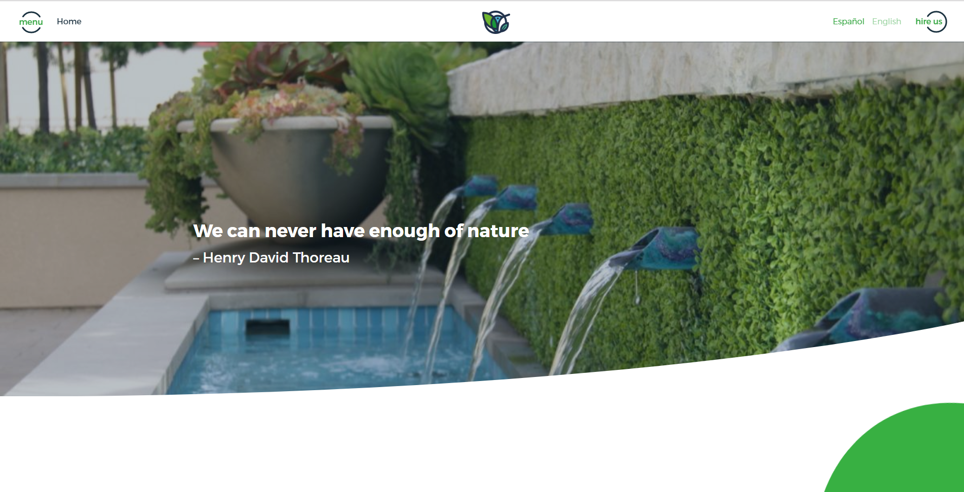
The Goods:
• High-Quality Visual Elements • Personable Homepage Copy
• Large, Visual-Forward Work Portfolio • Simple Yet Beautiful Sectional Layout
• Super Responsive, Smooth Navigation (peak the menu[above/below])
Agape Lawn Co.
Durham, North Carolina
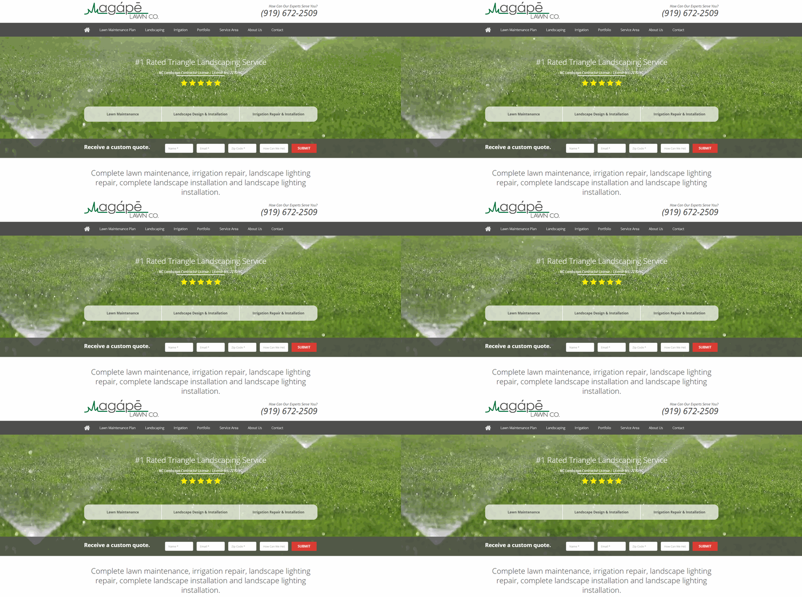
Sales conversion focused: There’s a right way and a wrong way to create a website focused on getting visitors to convert and Agape does it the right way. From the five star review front and center to the “receive a custom quote” form to the cleverly-worded section CTA’s, this website is designed to generate leads and customers at every turn without being overwhelming.
The Goods:
• Easy Navigation • Prominent Primary & Secondary CTAs
• Sales Conversion Focused • SEO Optimized
• Clean Sectional Layout • Informational Copy
CleanScapes Landscaping
Austin, Texas
Video header, sectional layout, engaging website: As you’ll see in some of the follow websites, the new trend is video headers. They’re a cool (relatively new) way to bring a website to live and CleanScapes uses it to perfection. You can also tell they created this website with their target market in mind. From the professional design to the concise copy, the entire website caters to their commercial property customers.
The Goods:
• Inviting Video Header • Easy Navigation
• Visual, Sectional Layout • Concise, Purposeful Copy
• Top-Notch “Services” Landing Page
Mid South Irrigation & Landscape
Cordova, Tennessee
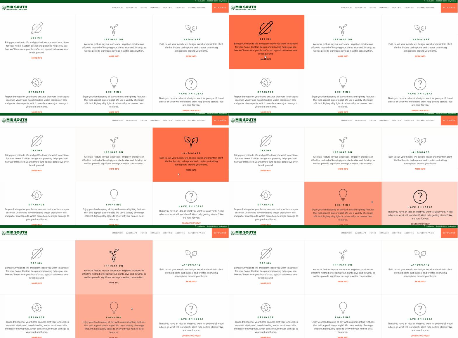
All-around beautiful and functional website: Like CleanScapes, Mid South employs a video header and from there the site only get better. Directly below is their philosophy, which lays out their value proposition and tells the visitor why they do what they do. Next is they start to break down their messaging around the different services so visitors can navigate to the info they’re looking for.
The Goods:
• Sharp Video Header • Smooth, Responsive Design
• Easy Navigation • Purposeful CTAs
• Well-Placed Forms
Terra Ferma Landscapes
San Francisco, California
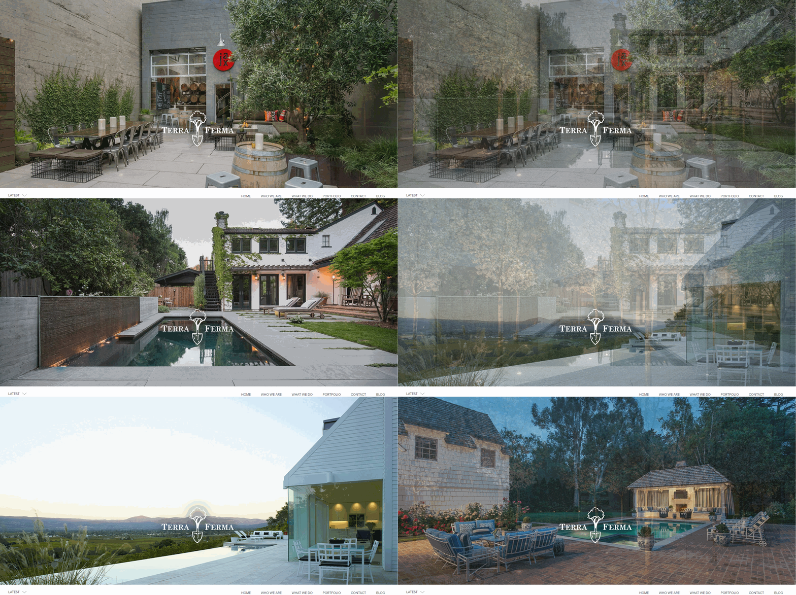
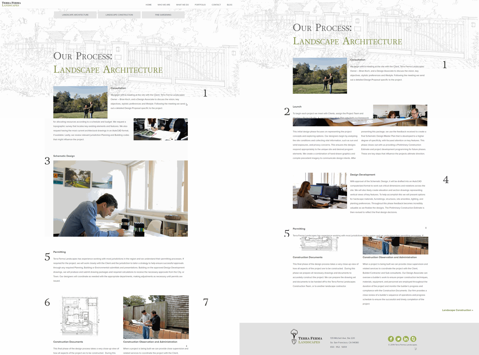
Large, engaging imagery invites you in: From the first image on Terra Ferma’s website, you can tell what they’re doing. They’re showing you the craftsmanship they can offer your landscape. Then on their landing pages, they break down their process, laying out, step-by-step, how they make landscapes look so dang nice.
The Goods:
• Elegant, Visual Header • Simple Sectional Layout
• Snappy Copy • Overall Easy Navigation
• Simple, Informational “Process” Page
Focal Point Outdoor Solutions, Inc.
Caseyville, Illinois
Show-stopping video header: Out of all the video headers out there, Focal Point Outdoor Solutions has the coolest one. From expansive drone shots to a handful of timelapses, I found myself watching the entire video (which is pretty long) multiple times. The rest of the site is no joke. The whole thing sets itself apart from most of the websites you’ll come across.
The Goods:
• Industry Best Video Header • Scroll Responsive Layouts
• Simple Sectional Structure • Consistent CTA Placement
• Professional Design • Easy Navigation
[via original 2017 post]
All Terrain Landscaping
Greeley, Colorado
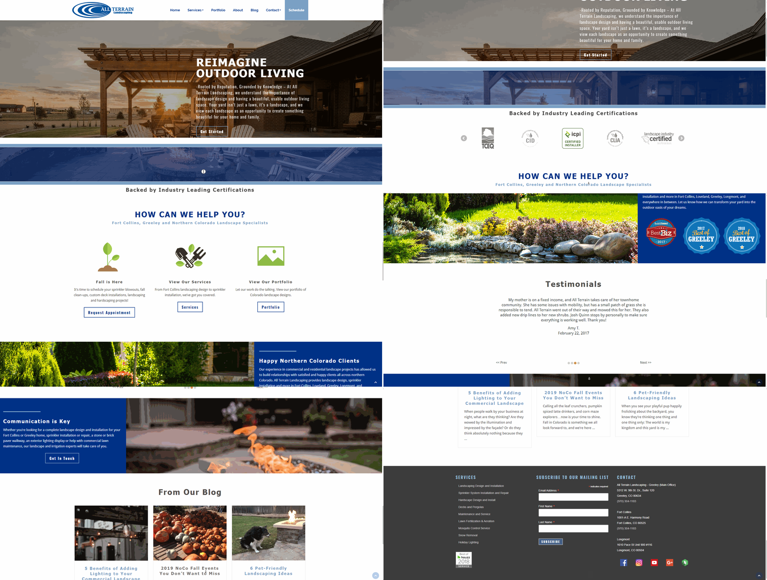
Leave them laughing and happy: From the story about how their first landscaping vehicle was an ‘84 hatchback Mustang to the tid-bits about the three brothers - visitors get warm welcome and maybe even a little chuckle.
The Goods:
• Prominent Primary and Secondary CTAs • Digestible Layout
• Responsive Design • Personal Tone
• Easy Navigation • Crisp Copy
Blue Jay Irrigation
London, Ontario
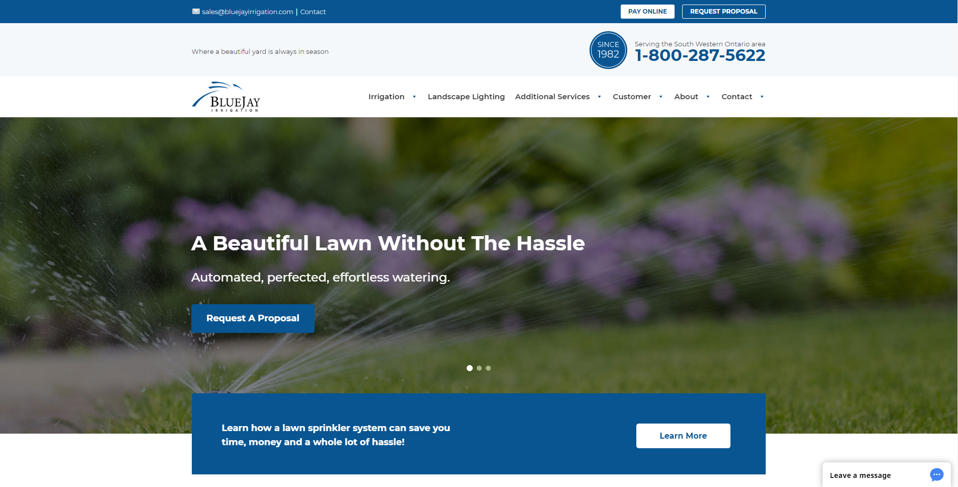
Give the people what they want: Having testimonials and FAQs in the navigation bar points visitors in the right direction and gives prospects the information they need to make a decision.
The Goods:
• Clear Presentation • Easy Navigation • Mobile Friendly
• Prominent Primary and Secondary CTAs
Nutri-Lawn
Many Locations Across Canada
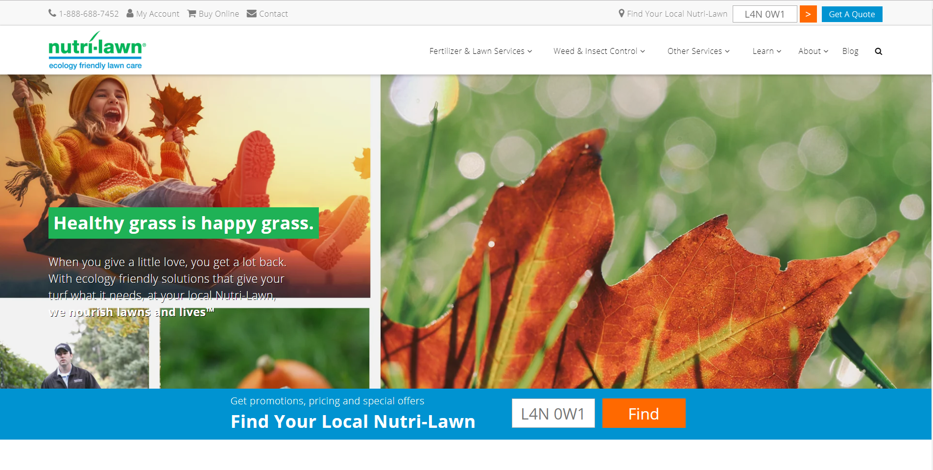
On a mission: Nutri-Lawn is a green industry powerhouse in Canada and their website is no slouch either. Even though they have an endless amount of information and content it’s easy to go exactly to your desired destination. Oh and they have a picture of a dog on their homepage.
The Goods:
• Digestible Layout • Responsive Design
• Easy Navigation • Rich Content
• Welcoming Homepage
Conserva Irrigation
Richmond, Virginia (HQ)
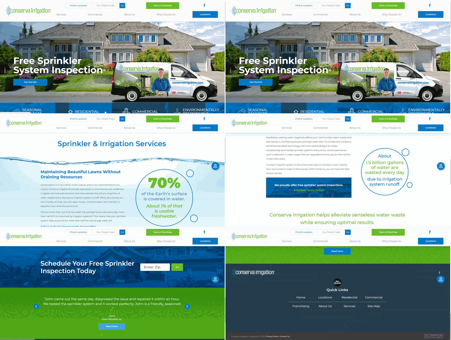
Keep it simple stupid: As a former copywriter I’m a sucker for snappy wording and this website has a crisp headline at every turn. This clean and simplified approach starts with their homepage - eliminating distractions and keeping visitors on track.
The Goods:
• Snappy Copy • Engaging Visuals • Mobile Friendly
• Easy Navigation • Simple Homepage Layout
• Unmistakable Primary & Secondary CTAs
Select Sprinklers
Burlington, Ontario
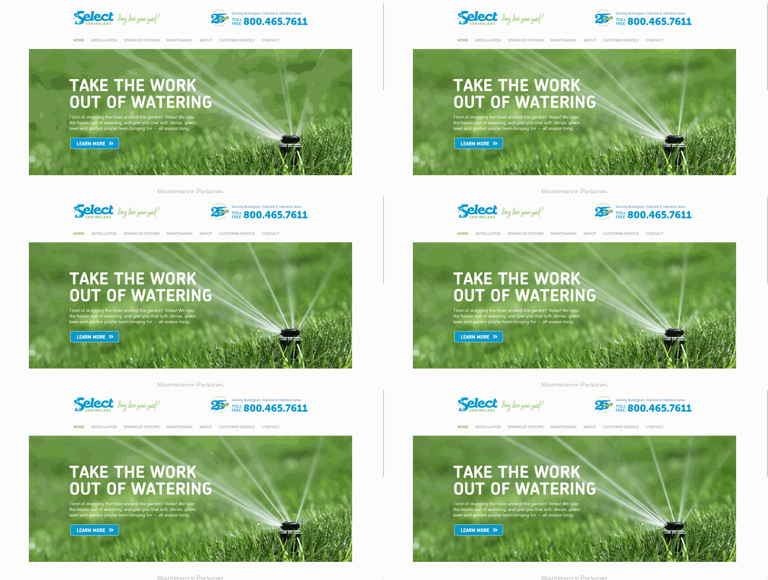
All round good stuff: From the homepage’s animated sprinkler visual to the placement of CTAs to the geo-targeted page title to the coherent layout on every page this website brings it from start to finish.
The Goods:
• Easy Navigation • Flat, Responsive Design • Animated Visuals
• Coherent Layout • Thoughtful CTA Placement
• Clever Copy • Mobile Friendly


