It’s not until you’re asked if you have a business card by someone when you don’t, that you feel the need to have one. Especially if you’re owner of a lawn care company since it reflects - to some extent - not just your professionalism but your business’s, as well (as you’ll see in the last section). So we’ve collected everything you need to know about lawn care business cards, from the perks of having one to tips on creating your own to all the helpful online resources to even some interesting business card facts.
Table of Contents
1. Life with a Lawn Care Business Card
2. Business Card Jargon
3. Designing a Great Lawn Care Business Card
4. Lawn Care Business Card Tools and Resources
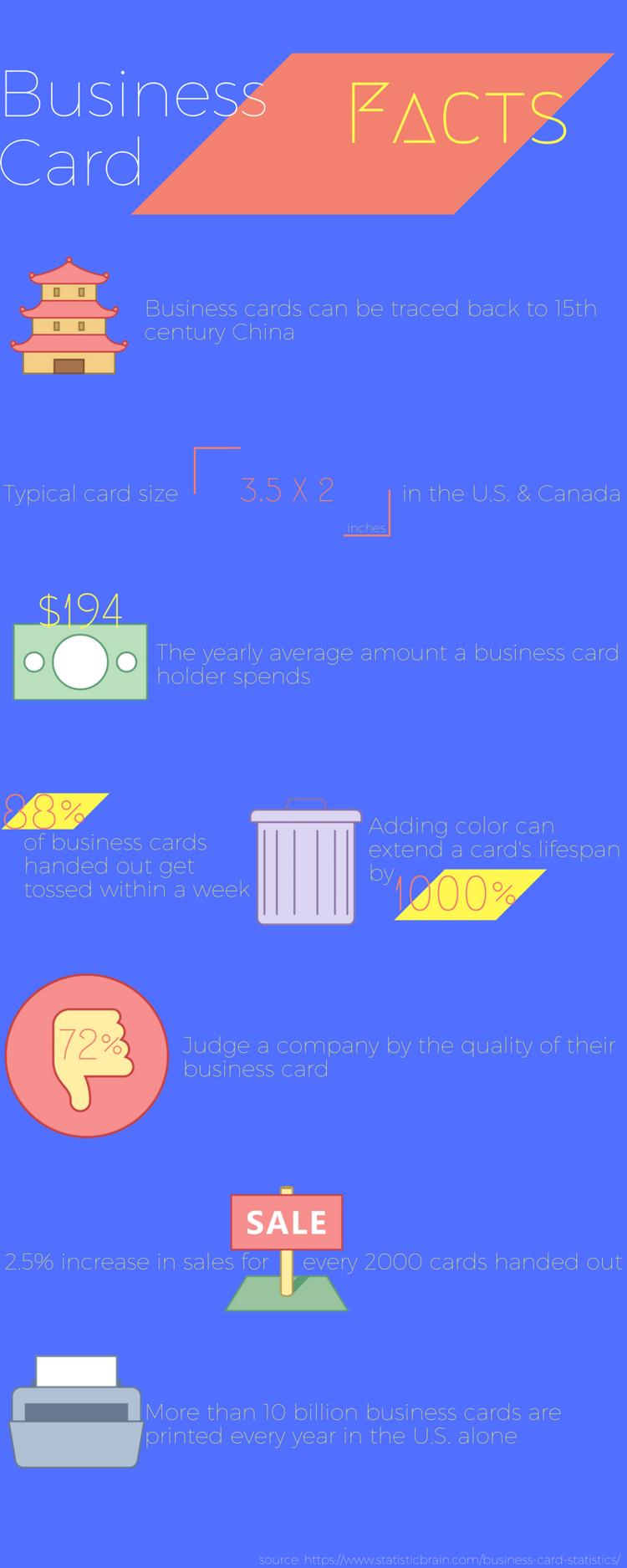
5. Business Card Facts [Infographic]
Lawn Care Business Cards 101
.gif?width=320&name=giphy%20(32).gif)
Life with a Business Card
Networking: Having a great business card give you and your lawn care business a the first impression you want.
Branding: It’s one of the easier and most effective types of printed marketing material a small business can have.
Professional: A business card not only conveys professionalism but it also shows you’re prepared.
Create Opportunities: If your card is effective, people will hold on to it. And this will directly and indirectly lead to sales and business opportunities.
Call-To-Action: The card’s text and its overall essence gives people a call to action, a to-do task - whether that’s sending an email or giving your business a ring.
Convenience: Instead of standing there punching in your number in someone's phone or slowly reciting your number, you can whip out a card and be on your way.
Business Card Jargon
Letterpress Printing: A process that utilizes inked raised surfaces, usually type, to create the image.
Lithography: This process utilizes flat or curved inked surfaces to create the printed images.
Embossing: Creates a raised, 3D effect to wording or design element.
Debossing: The opposite of embossing, impressing a design element past the papers surface.
Bleed: Printing that extends to the edge of a sheet or page after trimming.
Kerning: is the process of adjusting the spacing between characters in a proportional font, usually to achieve a visually pleasing result.
Watermark: Translucent mark or image that is visible when the paper is held up to the light.
Safe Areas: An area in the center, that most printers will tell you to keep your vital info so it doesn’t get lopped off during the process.
U/V Coating: Shiny and durable high gloss coating applied to printed material.
Weight (aka Paper-Weight): Refers to the thickness and sturdiness of the paper and is labeled in pounds (lbs) or grams per square meter (GSM).
Designing a Great Business Card
The Duhs
Readable: If it’s not readable it’s not going to be an effective business card simple enough.
Your Name & Role: For example something like, “Jimmy Richard, Owner of Top-Notch Lawn Care” is really all you need to do.
Contact Information: Consider including all or most of the following - your business phone number, personal phone number (if you choose), your email address, your business address and, if you have them, your business social media account information.
Logo & Slogan: As previously mentioned a business card is a great opportunity to solidify your brand so include your logo and slogan. If you don’t have a logo check out “How to Create a Lawn Care Logo” and if you need inspiration for a slogan give “Funny to Effective: The Best Lawn Care Slogans” a read.
The First-Steps
Design Approach: A straight-lace professional design can be just as powerful as an explosive and creative one. What matters is the execution.
Color: The right color pallette - whether vibrant or tame - can make or break a business card. It’s important the color scheme matches the business card’s overall design.
Visuals: From a simple little line to a minimalist icon to a full on image the right visual can make your business card stand out and save it from the trash.
Simple: When you’re trying to think about all the info and design elements you want to include in your card always lean towards simplicity. A congested layout and chaotic design will leave people confused more times than not.
Audience: The last thing you should think about during the initial steps is who you will be giving your cards to and what your card should and shouldn’t have to resonate with them.
The Minutiae
Raise or Depress: Embossing or debossing one of your design elements is an easier way to make your card a little more interesting. One element that makes most sense is your business logo.
Paper Thickness: Most business cards are printed on paper with 80 lbs. Cover Stock or more. You’ll want to make sure the paper isn’t too flimsy because it’ll reduce the card’s durability and professionalism.
Borderless: Don’t use borders, most biz card experts advise leaving a 3mm bleed around the edges of your card because nobody’s perfect and printing processes aren’t either. A wonky border will make your card look sloppy.
The experimental
These are less tips and more ideas that can seperate yours from the everyday business card.
Shape-Shift: Instead of the everyday 3.5 x 2 in. card, chose different dimensions like a square or slim rectangle.
Orientation: Or you can keep the typical dimension but instead flip-it on its side and have a vertical design. [see example below]

Give it a home: Having a sleeve for your cards can really class-up the whole presentation.
See-Through: A few years ago it felt like a lot of people started using transparent and translucent design elements. It can be expensive but cool if properly executed.
Unconventional Materials: From wood to metal to rubber to whatever you can think of, nowadays you can print your business card on pretty much anything - just so it doesn’t cause too much distraction.
Interchangeable Element: If you’re like most lawn care businesses you offer a few services. So one idea could be putting interchangeable icons that represent these services on one side of the card. [see example below]
![]()
![]()
![]()
Business Card Tools and Resources
DIY: Design It Yourself
.gif?width=380&name=giphy%20(35).gif)
Adobe InDesign: If you’re family with using Adobe software, InDesign allows you to do pretty much anything you want when it comes to laying out a page.
Adobe Spark: It’s a free design tool that I haven’t use this personally, but it seems like it’s similar to other Adobe products but just toned-down and not as overwhelming to use. I would guess it’s probably pretty amazing like everything else they do.
Microsoft Office: Designing isn’t always the most user-friendly experience, but it’s not an awful option if you already own and use the software.
Canva: This is a free graphic-design tool website. Here at HindSite, we use Canva for more simple designs that we need to make quickly. It’s a simple, easy-to-use design tool that allows you to efficiently design without sacrificing the quality of the end result. They also have a ton of great looking business card templates that you can design from if you need a little help getting the ball rolling. Lastly, they have started offering prints of the designs you created. I have personally not used that feature so can’t really say what’s that like.
Ready-To-Use Templates & Designs
Creative Market: 9,100 different templates from standard, square, and folded to a bunch of other layouts, styles and designs.
Microsoft Office: As previously mentioned, they also offer quite a few templates.
Vistaprint: A well-known all-in-one (templates, design/customize and print) shop.
YouPrint: This company is very similar to Vistaprint the only thing different is most likely price.
Designer(s) For Hire:
99designs: I’ve only heard great things from people who’ve used this site. They crowdsource the process by having a “Design Contest” that give you a bunch of concepts that you’re guaranteed to love (or you get your money back).
Business Card Facts & Stats

.gif)


![[Related: Lawn Care Name Generator]](https://no-cache.hubspot.com/cta/default/152131/3e21964e-f40a-44bf-ac0c-51dd16250262.png)
.gif?width=380&name=giphy%20(36).gif)
![[Related: Best Lawn Care Logos]](https://no-cache.hubspot.com/cta/default/152131/071abc0d-973e-4f11-a7ab-3255434fe1b6.png)
.gif?width=245&height=206&name=giphy%20(31).gif)
![[Related: How to Make a Great Lawn Care Flyer]](https://no-cache.hubspot.com/cta/default/152131/dd135ff6-f787-41ea-bf36-7e40580c5c15.png)
